Designing a cohesive home requires a careful balance of materials. When planning an open-concept layout or high-end renovation, your choice of tile flooring establishes the visual foundation for adjacent hardwood, custom millwork, and natural stone surfaces.
Achieving a harmonious flow takes more than just picking matching colours. It requires balancing undertones, managing physical material transitions, and choosing the right products to handle daily life without compromising on style.
1. Master Warm and Cool Undertones
Every material carries a subtle temperature. Hardwood often leans warm with honey, golden, or reddish hues, whereas natural stone can range from cool gray marble to warm travertine.
Read More: How Do You Design an Outdoor Kitchen for Al Fresco Living in Dubai?
To bring these elements together, look for tiles that bridge both spectrums. A greige or soft off-white tile flooring option acts as an effective neutral connector, tying cool stone counters to warm oak cabinetry without visual clash.
2. Transition Cleanly Between Tile and Hardwood
Where tile meets hardwood, such as between a kitchen and a formal living space, the transition should feel intentional rather than sudden.
- Use flush metal transition strips in brass or matte black for a sleek, contemporary profile.
- Align the direction of your wood planks parallel to the tile threshold to create a tailored, clean boundary.
- Choose high-density porcelain for kitchen and entryway floors, as it withstands moisture and heavy foot traffic far better than softer materials.
3. Complement Cabinetry and Detailed Millwork
Your floor should anchor your cabinetry, not compete with it. If your kitchen features bold, dark walnut millwork or intricate paneling, pair it with an understated, large-format tile.
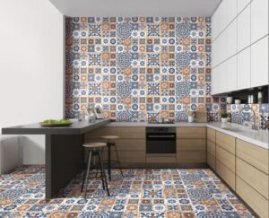
Conversely, if you have minimalist white shaker cabinets, a subtle stone-look surface or geometric floor pattern adds welcome depth and character.
4. Let Grout Work for the Overall Palette
Grout line colour can quietly transform an entire room. Selecting a grout shade that closely matches your tile creates a smooth, continuous field that expands the visual feel of a space.
On the other hand, choosing a slightly contrasting grout highlights unique layout patterns like herringbone or chevron. Ensure you select premium, stain-resistant grout for low-maintenance upkeep in busy zones.
5. Expand Open Plans with Large-Format Porcelain
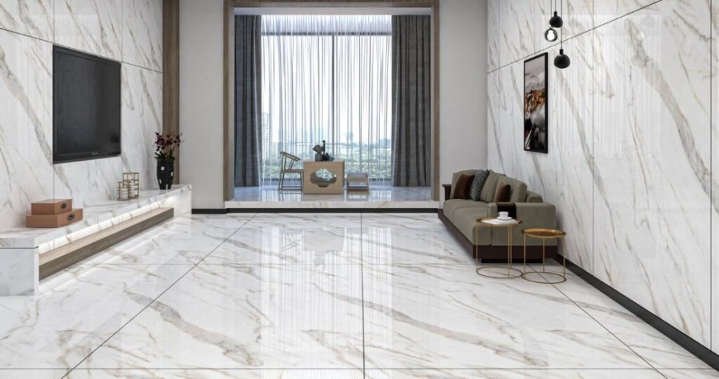
Large-format porcelain tiles significantly reduce the number of grout lines, creating expansive, uncluttered floor surfaces. Premium stone-look porcelain offers the depth and organic character of natural marble or limestone, but with superior resistance to stains, scratches, and water absorption. Reserve delicate natural stone for decorative accents or low-impact feature areas where it won’t face constant wear.
6. Evaluate Samples Under Real Lighting
Tile glazes and natural stone veining change character depending on light exposure. North-facing rooms draw cooler daylight, which can make gray tones feel flat, while warm indoor lighting can alter wood tones dramatically.
Before placing a final order, bring tile, wood, and millwork samples directly into your space. Observing them together at different times of day ensures your palette remains balanced under morning sun and evening lamps alike.
Read More: Top 5 Swimming Pool Features to Include in Your Custom Build